Modern Living Room Color Ideas to Instantly Refresh Your Space
Table of Contents
Struggling to update your living room without a major renovation? Start with color. A new color palette can completely transform your space, making it feel bigger, brighter, and more on-trend—no demolition required. In fact, over 70% of interior designers agree that wall color has the single greatest impact on a room’s mood and style.
Modern living room color ideas are all about balance—combining bold statements with serene neutrals, and timeless elegance with current trends. Whether you’re craving cozy earth tones, sleek monochromes, or a splash of unexpected vibrance, the right palette can bring your space to life.
In this guide, we’ll walk through the most stylish color combinations for modern living rooms, including expert tips on pairing hues, furniture integration, and visual balance. You’ll also find side-by-side comparisons, step-by-step tips, and vivid visual prompts to inspire your next living room refresh.
In-Depth Outline:
1. The Power of Color in Modern Living Room Design
Why Color Matters
- Sets the mood and tone of the entire space.
- Influences perception of space (light vs dark).
- Impacts how furniture and decor are perceived.
Color Psychology Basics
- Blues and greens = calming.
- Earth tones = cozy and grounded.
- Bright hues = energizing and cheerful.
Trends in Modern Spaces
- Soft minimalism: neutral palettes with depth.
- High contrast: bold accents with white or gray backdrops.
- Natural inspiration: organic shades from nature.
2. Trending Modern Color Combinations
Neutral & Earthy Pairings
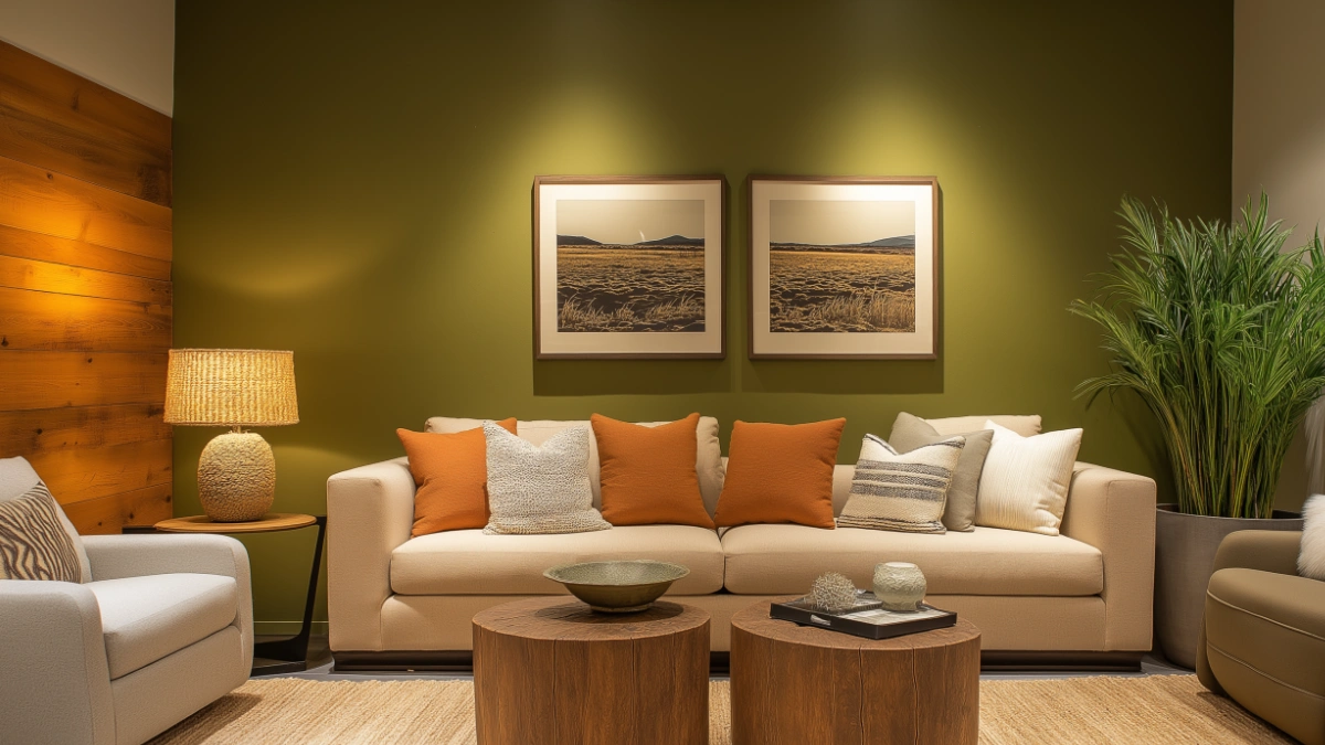
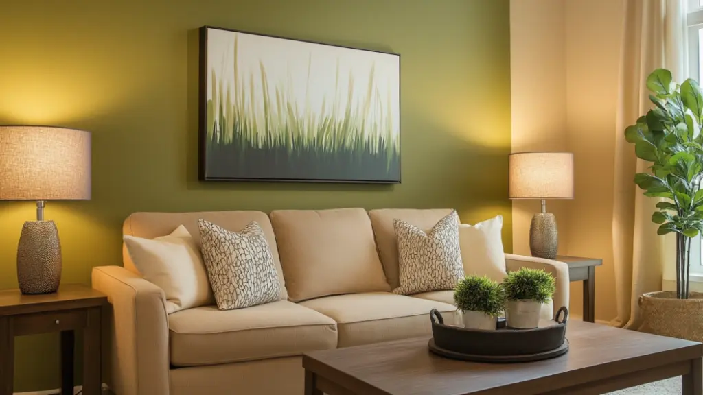
- Greige + Olive Green
- Warm White + Terracotta
- Taupe + Rust Orange
Cool & Contemporary
- Charcoal + Dusty Blue
- Sage + Black
- Pale Gray + Navy
Bold & Eclectic
- Emerald Green + Brass
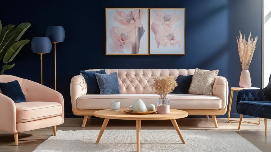
- Midnight Blue + Blush
- Mustard + Deep Teal
Modern Color Pairing Table
| Main Color | Accent Color | Style Vibe |
|---|---|---|
| Greige | Olive Green | Organic Modern |
| Charcoal | Dusty Blue | Urban Minimalist |
| Terracotta | Warm White | Boho Contemporary |
| Navy | Blush | Feminine Modern |
3. Using Paint to Define and Enhance Space
Feature Walls
- Highlight one wall with a bold hue or texture.
- Works well behind the sofa or TV area.
Ceiling and Trim Contrast
- Use light ceiling + dark walls to add depth.
- Invert for high-ceiling rooms to reduce starkness.
Color Blocking Techniques
- Separate open layouts with color shifts.
- Try geometric patterns or soft transitions.
Step-by-Step Paint Strategy
| Technique | Ideal For | Effect Created |
|---|---|---|
| Accent Wall | Small or awkward spaces | Adds a focal point |
| Monochrome Layering | Large open-concept layouts | Creates cohesion |
| Ceiling Contrast | Tall rooms with poor lighting | Makes room feel grounded |
4. Coordinating Color with Furniture and Decor
Anchor Pieces
- Choose a couch or rug in a neutral tone.
- Add accents that contrast (pillows, throws, art).
Material Matching
- Use wood tones, metals, and textiles to complement the color scheme.
- Brass with emerald green, black metal with cool grays.
Balance and Placement
- Follow the 60-30-10 rule (main color, secondary, accent).
- Don’t overcrowd bold color with equally strong furniture finishes.
Furniture-Color Matching Table
| Furniture Finish | Best Color Pairings | Styling Tip |
|---|---|---|
| Light Wood | Sage, Beige, Soft White | Great for Scandinavian looks |
| Black Metal | Pale Gray, Teal, Blush | Adds contrast and edge |
| Warm Leather | Cream, Olive, Terracotta | Enhances cozy atmosphere |
5. Lighting: How It Affects Perceived Color
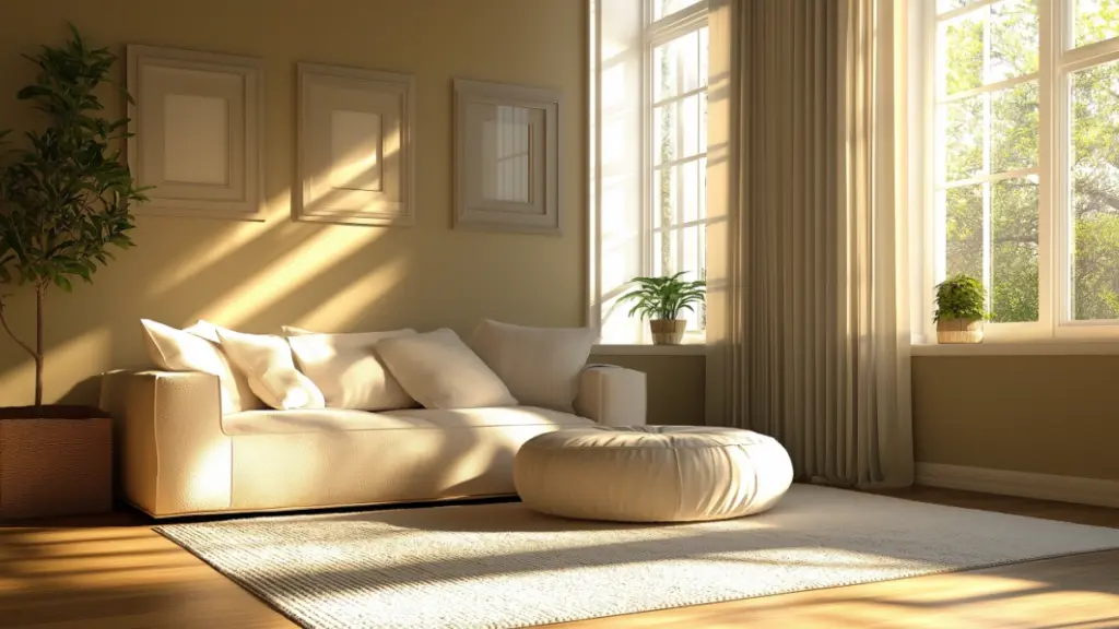
Natural Light vs Artificial
- South-facing = warm light (enhances cooler tones).
- North-facing = cooler light (softens warm tones).
Choosing Bulbs for Color Harmony
- Warm white (2700K–3000K) works with earth tones.
- Cool white (4000K–5000K) suits modern gray or blue palettes.
Tips to Test Paint Shades
- Paint swatches on different walls.
- Observe at multiple times of day.
Light Direction & Color Impact Table
| Light Source | Effect on Color | Best Colors to Use |
|---|---|---|
| North-Facing | Cool tones exaggerated | Warm whites, taupe, peach |
| South-Facing | Warms all colors | Cool grays, sage, navy |
| East/West-Facing | Shifts throughout day | Neutral base with soft hues |
6. Accent Decor: Pillows, Art, and Accessories
Textiles
- Swap out pillow covers seasonally.
- Layer tones with different textures.
Wall Art
- Large-scale canvas with modern hues.
- Choose complementary or analogous colors.
Accessories
- Use planters, ceramics, books, and trays for color repetition.
- Stick to a cohesive color range for harmony.
Color Accessory Ideas Table
| Accent Type | Color Suggestions | Placement Idea |
|---|---|---|
| Throw Pillows | Sage, Blush, Rust | Sofa, Accent Chair |
| Planters | Matte White, Black, Clay | Corners, Window Sills |
| Wall Art | Navy, Beige, Charcoal | Above Couch or Console |
Detailed Content Expansion:
3. Using Paint to Define and Enhance Space
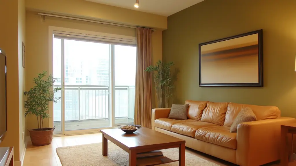
Color isn’t just about aesthetics—it’s also a tool to define and structure your living room. Paint can shape how you experience space by drawing the eye, adding depth, or setting focal points.
Start with accent walls. Choose one wall—typically behind the main seating area—to highlight with a bolder shade like terracotta, navy, or charcoal. This draws attention and anchors the room, especially useful in open-plan designs.
Ceiling and trim contrast is another modern technique. If your room has tall ceilings and feels a bit stark, painting the ceiling a few shades darker than the walls can bring warmth and balance. Conversely, a white ceiling and light trim can enhance light reflection in smaller rooms.
Color blocking is ideal for large spaces or multipurpose living rooms. By applying different hues to separate areas—like an olive green reading nook and a beige seating zone—you can create natural transitions without needing walls.
Always test your paint swatches in daylight and artificial light before committing. The same color can appear drastically different at sunrise versus sunset.
4. Coordinating Color with Furniture and Decor
Once your walls are painted, the next challenge is ensuring your furniture and décor complement—not clash—with your palette. This step is crucial for a cohesive, intentional look.
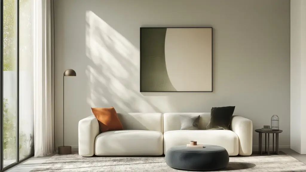
Start with anchor furniture. A neutral-toned couch (beige, gray, cream) provides a flexible base that adapts to changing color trends. Once that’s in place, build layers with throw pillows, area rugs, and side tables in either complementary or contrasting tones.
The material and finish of your furniture also play a big role. Warm wood pairs beautifully with earthy colors like rust and olive, while metal frames—especially in black or brushed brass—shine against cooler tones like pale gray or teal. When combining elements, aim for balance. For instance, if your walls are rich and bold, keep your furniture lighter or neutral for contrast.
A helpful rule of thumb is the 60-30-10 ratio: use your primary wall color for 60% of the room, a secondary tone (often found in furniture or rugs) for 30%, and an accent hue (in decor or art) for the remaining 10%.
Conclusion
Color has the power to completely transform your living room—from boosting its style to altering how it feels and functions. By exploring modern combinations, understanding lighting effects, and pairing colors with the right textures and furniture, you can achieve a refreshing update that feels professionally designed. Whether you prefer soft earth tones or bold contrasts, these living room color ideas will help you create a space that’s both stylish and truly your own.