Creating Mood with Color: Home Design Strategies to Transform Every Room
Table of Contents
Introduction
Color isn’t just a design detail—it’s a mood-setting powerhouse. Whether you’re looking to create a peaceful retreat, a lively entertaining space, or a cozy corner to unwind, your home’s color palette has the power to shape how every room feels.
According to a 2023 Sherwin-Williams consumer survey, over 70% of homeowners say color influences their emotional experience in a space. Yet many people struggle with choosing the right colors to reflect the mood they want. That’s where strategic color planning comes in.
In this guide, we’ll walk through practical home color design strategies that use psychology, lighting, and layering techniques to create harmony and emotional resonance in your space. From calming blues in the bedroom to energizing citrus tones in the kitchen, you’ll discover how to build intentional palettes that enhance your home and your lifestyle.
Whether you’re painting a whole room or simply updating accessories, these ideas are tailored to help you elevate your space with confidence and cohesion. Let’s dive into how the right color choices can transform your home—one wall, accent, and tone at a time.
In-Depth Outline
1. Understanding the Psychology of Color
- How colors affect mood, behavior, and room function.
- Warm colors energize; cool colors calm.
- Bold hues add drama, while neutrals create balance.
- Use color to guide emotional flow from room to room.
- Adjust color based on natural light and room orientation.
H3: Emotional Associations with Key Colors
- Blue = calm, trust, clarity
- Yellow = cheer, optimism
- Green = balance, growth
- Red = energy, passion
H3: Choosing Colors for Functionality
- Use cool tones in bedrooms and bathrooms for calm.
- Use warm tones in kitchens, dining rooms, and offices for energy.
Table: Color Emotion Reference Chart
| Color | Associated Mood | Best Use Areas |
|---|---|---|
| Blue | Calm, clarity | Bedrooms, bathrooms |
| Green | Balance, refreshment | Kitchens, living rooms |
| Yellow | Optimism, energy | Entryways, kitchens |
| Red | Passion, stimulation | Dining rooms, creative spaces |
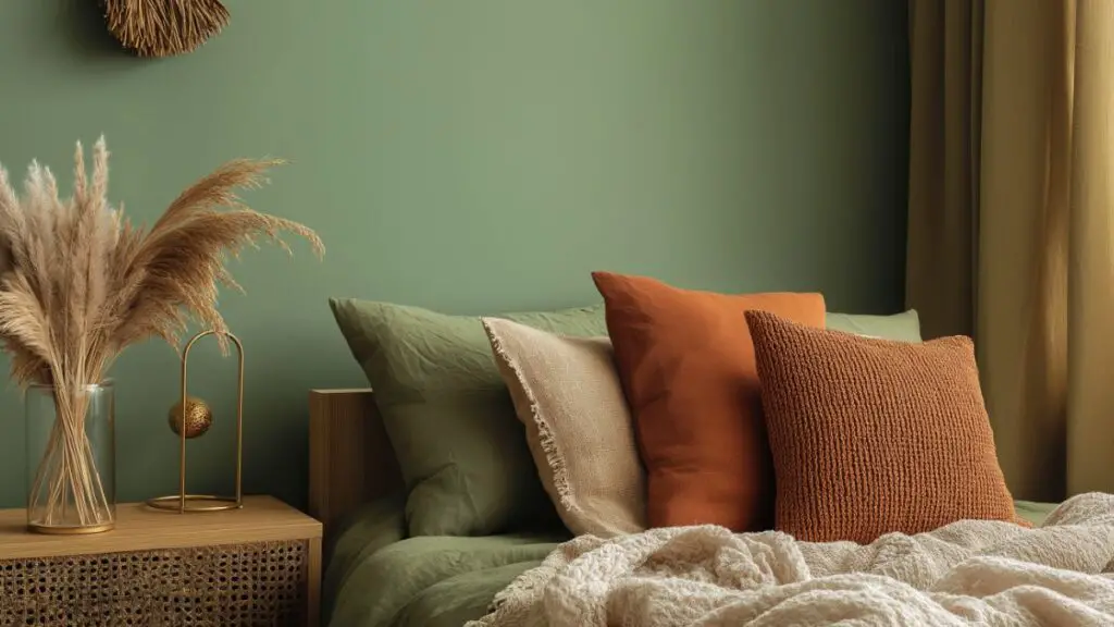
2. Creating Mood-Driven Color Palettes
Designing an intentional color palette starts with how you want a space to feel. Every room in your home has a purpose—and your colors should support it. Whether it’s serenity in the bedroom or energy in the kitchen, mood-first color strategy is the key to cohesive design.
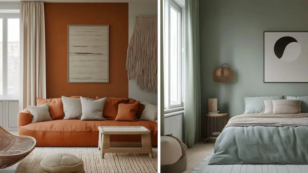
For Calm and Relaxation
Choose soft, cool colors like pale blue, muted green, greige, and lavender. These hues are proven to lower heart rates and reduce stress.
- Bedrooms: Light blue walls with ivory bedding.
- Bathrooms: Sage or pale mint paired with matte black fixtures.
- Reading Nooks: Soft taupe walls and warm cream textiles.
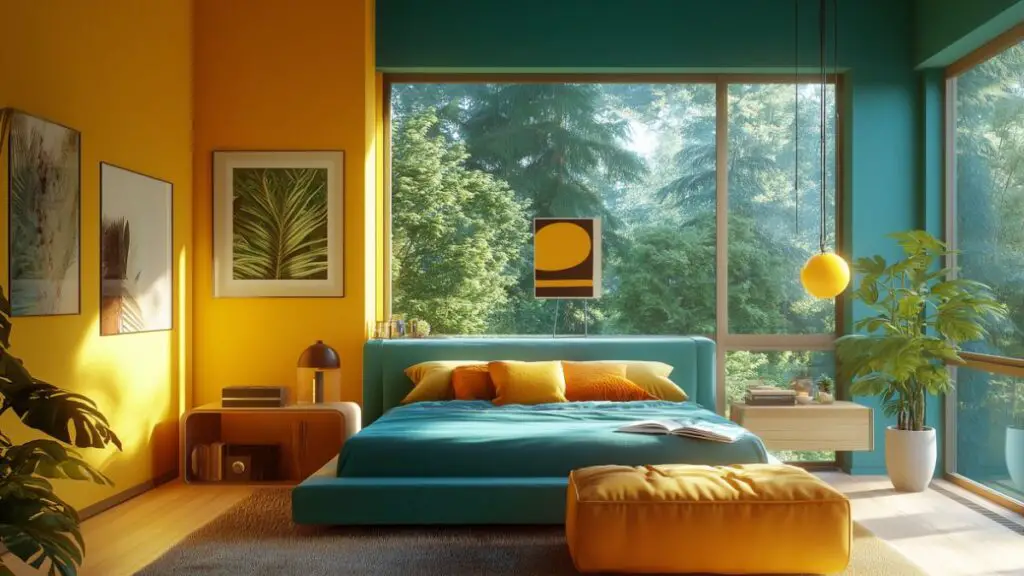
For Energy and Warmth
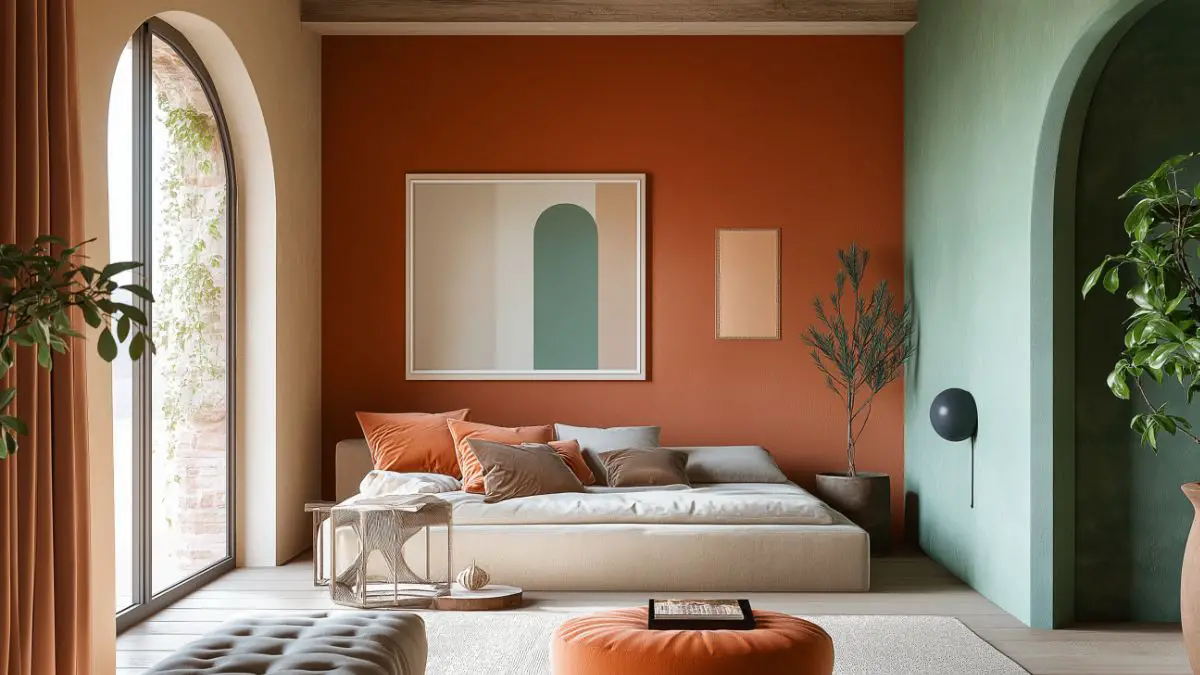
Warm colors like terracotta, ochre, and coral stimulate conversation and creativity. Perfect for social areas and workspaces.
- Living Rooms: Terracotta accent wall and beige upholstery.
- Offices: Mustard yellow or deep coral walls with neutral furniture.
- Dining Areas: Rust-colored chairs with warm-toned art.
Table: Mood-Based Color Palette Guide
| Mood | Primary Tones | Accent Suggestions |
|---|---|---|
| Calm | Blue, sage, taupe | Ivory, soft white, gray |
| Energized | Terracotta, ochre, coral | Brass, natural wood, black |
| Cozy | Deep green, plum, cinnamon | Beige, linen, gold |
The key is consistency. Choose a base tone for each room and support it with complementary accent colors and textures that reinforce the desired emotional vibe.
3. Using Color Strategically by Room
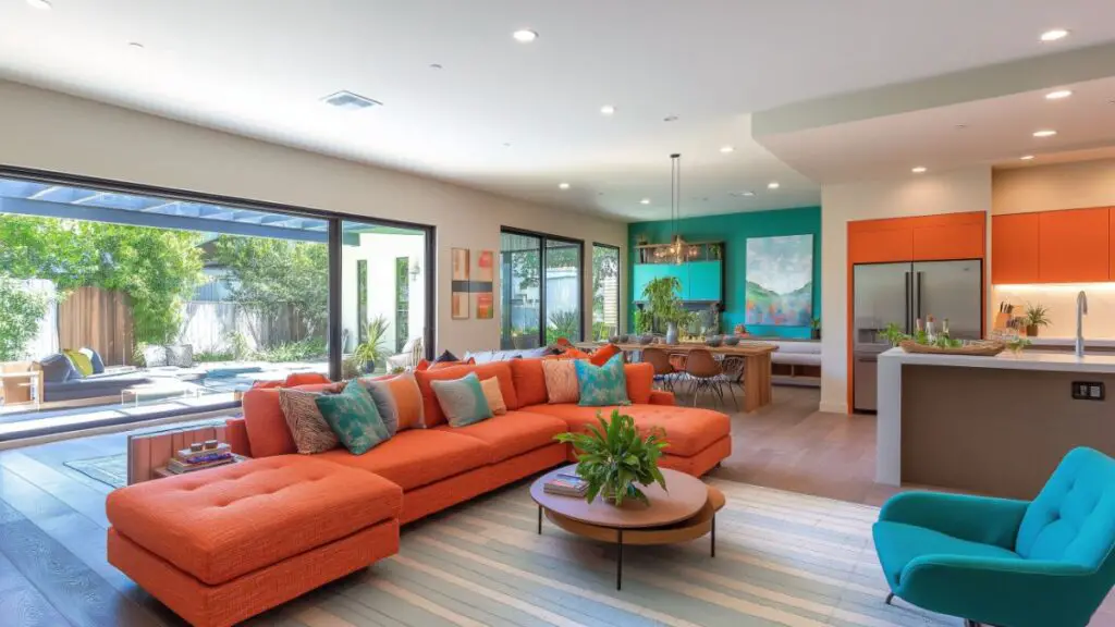
- Living Room: Jewel tones like emerald or sapphire add depth and richness.
- Bedroom: Soft blush, sage, or greige for a peaceful atmosphere.
- Kitchen: Citrus tones like lemon or coral can enhance brightness.
- Bathroom: Monochromatic palettes in blue or charcoal feel clean and calming.
- Office/Studio: Deep teal, rust, or forest green inspire focus and creativity.
H3: Open Concept Layout Tips
- Use color zoning to subtly define spaces.
- Repeat tones across the room in furniture, rugs, and art.
- Use one neutral base with two mood-enhancing accent colors.
H3: Cohesion Across Rooms
- Choose a master palette and adjust shade intensity per room.
- Keep undertones (warm or cool) consistent throughout.
Table: Color Suggestions by Room Function
| Room Type | Recommended Colors | Mood Outcome |
|---|---|---|
| Living Room | Emerald, cinnamon, taupe | Inviting, cozy |
| Bedroom | Lavender, sage, greige | Calm, restful |
| Kitchen | Coral, mustard, pale green | Bright, energetic |
| Office | Teal, rust, navy | Productive, focused |
4. Layering Color: Paint, Decor, and Texture
Mood-setting with color isn’t just about walls—it’s about layering. Thoughtfully applying color through furniture, textiles, art, and finishes creates a multi-dimensional atmosphere.
Walls Set the Foundation
Paint color is your canvas. Choose soft sheens (eggshell, satin) for warm light reflection. For subtle drama, try a tonal palette—walls and trim in the same hue but different finishes.
Decor and Accents Bring Depth
Add intentional color in furniture, pillows, throws, and decorative pieces. Even a mustard ceramic vase or rust-toned velvet cushion can shift the mood of a neutral space.
- Match decor accents with secondary colors in your palette.
- Use tonal layering (e.g., multiple shades of green) for sophistication.
- Limit bold colors to 10–30% of the room for balance.
Textiles Introduce Softness
Rugs, curtains, and bedding absorb and reflect light, enhancing warmth or coolness.
- Pair warm tones with nubby textures like boucle and linen.
- Use cooler tones with smooth textures like silk or crisp cotton.
Table: Color Layering Guide by Element
| Element | Color Strategy | Texture Tip |
|---|---|---|
| Walls | Base tone or backdrop | Matte or satin finish |
| Textiles | Accent or contrast tone | Match texture to mood |
| Decor | Pop or echo tone | Mix with neutrals |
5. Lighting and Its Impact on Color Mood
- Natural light enhances cool tones and washes out warm hues.
- North-facing rooms benefit from warm colors like peach or buttercream.
- Use warm bulbs (2700–3000K) to amplify coziness.
- Accent lighting (lamps, sconces) can spotlight feature walls or art.
- Dimmer switches allow mood flexibility in living and dining areas.
H3: Best Bulb Types for Home Atmosphere
- LED bulbs with CRI 90+ for accurate color rendering.
- Soft white for relaxing areas, daylight for workspaces.
H3: Strategic Lighting Tips
- Layer ambient, task, and accent lighting.
- Use uplighting to add depth to dark corners.
Table: Color + Lighting Planning
| Room Orientation | Light Type | Best Colors to Use |
|---|---|---|
| North-facing | Cooler light | Warm tones (peach, gold) |
| South-facing | Warm, strong light | Muted tones, deep colors |
| West-facing | Sunset hues | Earthy, soft neutrals |
Conclusion
Color is more than an aesthetic choice—it’s a language that shapes how we feel in our spaces. By aligning color choices with the mood you want to evoke, you create a home that not only looks beautiful but feels intentional and emotionally resonant.
Whether you’re softening a bedroom with sage and cream, energizing a kitchen with coral accents, or grounding your living room with deep greens, the right palette brings personality, warmth, and harmony to your home. Strategic layering, thoughtful lighting, and cohesive accents all play a role in supporting that mood.
With a clear vision and a few smart color strategies, you can transform every room into a sanctuary that reflects both your design style and the way you want to live.